Create provides access to aggregated public urban environmental and property market data via a 3D map.
Create offers a preexisting product and we were asked to work on the following:
1. (Conduct) An overall assessment of the site's functionality and intuitiveness.
2. (Design) A way for brokers to send multiple properties with user tours to clients before going out to view the properties.
I worked on creating the script for usability testing sessions, sketching during the ideation phase, wireframes, creating higher fidelity mock designs, and creating a clickable prototype of the basic tutorial. I also worked on the advanced tutorial and the broker tour.

We began by performing a heuristic evaluation of the exsiting application. We wanted to uncover any potential pain points current users might be experiencing. The application contained a very large data set reachable by many paths.

We interviewed members of the commercial real estate community about their workflows in order to get feedback on what was important to them, sent out a survey, performed in person usability tests, and set up testing scenarios on usertesting.com.
Testing revealed that most users had specific workflows and were interested in specific data points. Additional research revealed a lack of awareness of key features and navigational possibilities within the application. We also learned that data transfer from within the application to external sources (like Excel) in order to organize, interpret, and collect specific data points was not uncommon.
All of these items warranted attention. The former could be solved with better education. The later was a potential flaw in the application's functionality but would remain outside of our scope due to time constraints.
There was an apparent lack of understanding of the core functionality of the application and how to efficiently navigate to pertinent data.
Our theory was that the on boarding process was the cause of the lack of awareness of key features and navigation avenues. People we tested were missing out on what Create had to offer, a much more enjoyable experience.
I looked into other effective on boarding processes. With aspirations of increasing learnability and memorability, I was guided toward making the tutorial process an interactive one. My hypothesis was that by engaging users with brief interactive tasks and positive feedback upon completion of said tasks we could achieve our goal. Similar to a tutorial within a video game. Learn by doing.

I next hypothesized that by taking advantage of color as a part of the design language, increased learnability and memorability could be achieved. I used orange to signal elements of high importance or focus and blue to signal interactive elements with the expectation that this consistency would provide visual cues to people using the product.
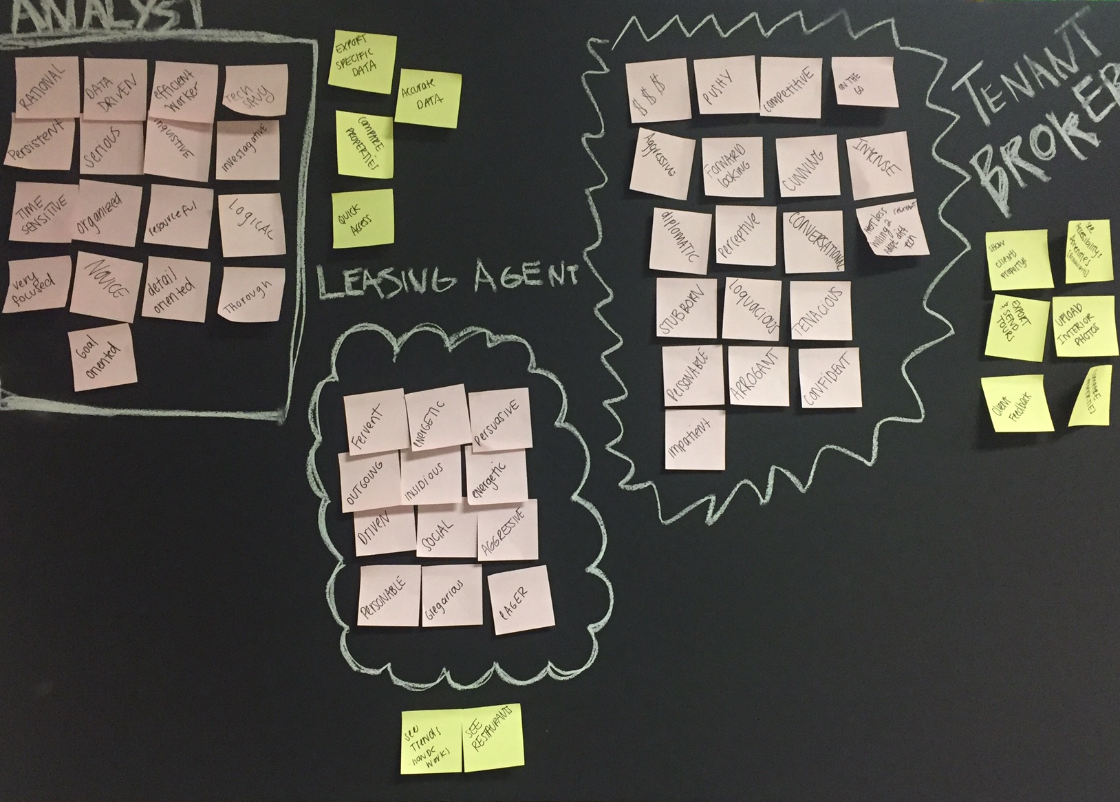
We constructed three personas using Affinity Mapping to organize traits into groups and then used word clusters to highlight the most prominent traits for each persona. This would provide us with additional insight into what was most important to each audience.


We began ideating ways we could improve the tutorials. At the time there were three separate tutorials as part of the on boarding process. One introducing "The Basics", one for city data, and one to find properties. In our tests the directions were not always clear to the participant. At the conclusion of the tutorial participants weren't always certain how to proceed.
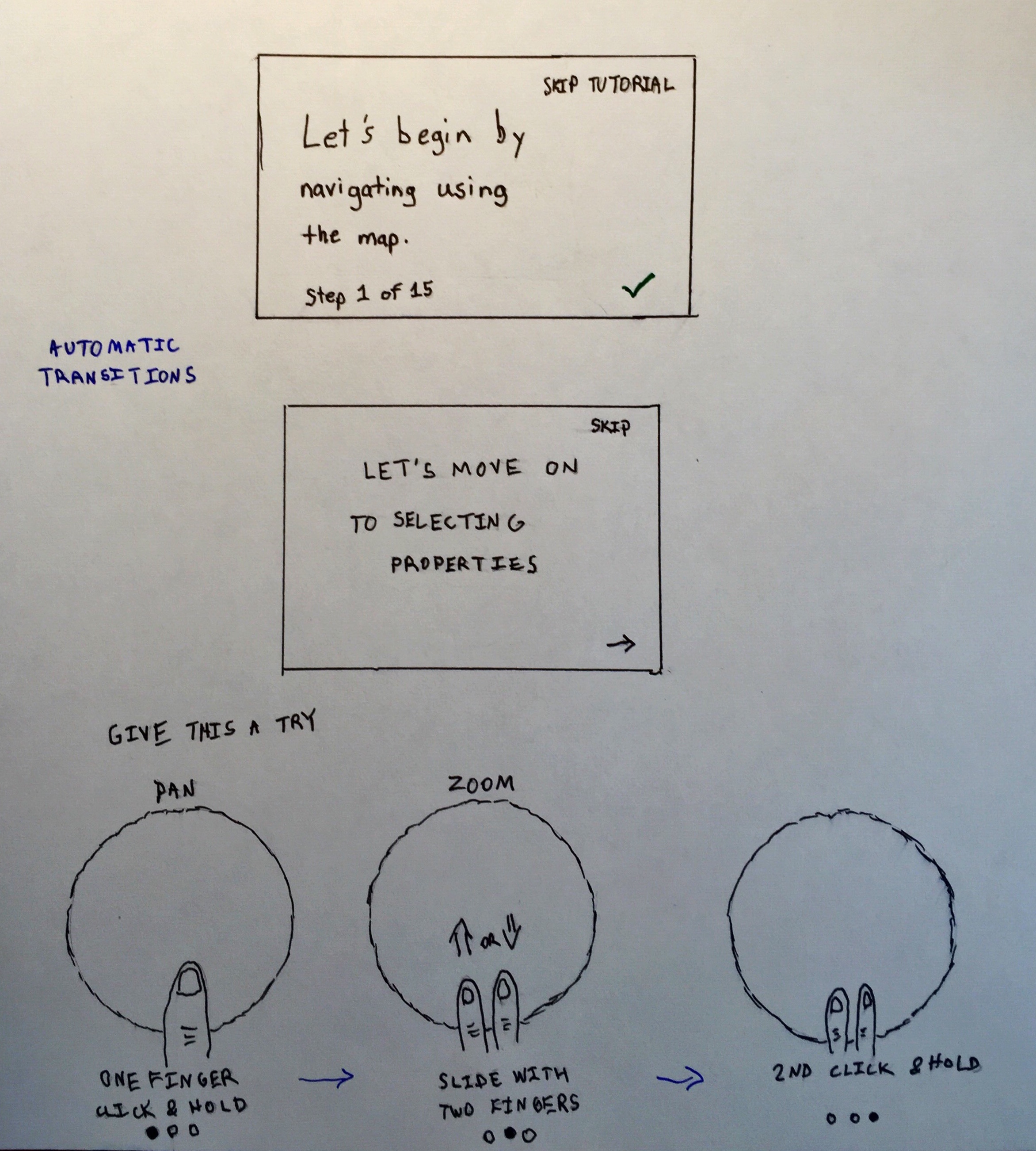

We then began thinking about ways to reduce the number of tutorial options creating one guided tour while at the same time increasing the tutorial's ability to increase the application's learnability and memorability. We planned to accomplish this by consolidating the tutorial into one process and by adding navigation through property data and the introduction the map layers and filters features.
The Design Studio brought about great ideas for the tutorial design and in the end we reached consensus on a design to move forward with. A design that included an indication of progress through the tutorial and a list of upcoming and prior topics within a particular section. Once we explored a few options via wireframes in Axure I began transitioning them to higher fidelity mocks.

During the prototyping phase I introduced the color design language and instructions with interactive portions. I wanted to engage the audience by providing illustrated instructions alongside written ones. The idea being with each task after a person performs the instruction within the application feedback is provided to indicate completion followed by automatic advancement to the next task. I also wanted to provide the flexibility to go at one's own pace. There would be options to skip tasks or entire sections and to go back to previous tasks as well.


We also wanted to include additional tutorials for advanced features that would appear after the basic tutorial when the layers or filters features had been selected. A prompt would present the option to continue learning more if the person were interested. This would only appear one time but could be accessed thereafter by selecting the "?" help section on the left panel.
Clickable prototype can be found here.
In the end education was our main focus. Our research led us in that direction. Our goal was to empower people using the application to reach their goal. Our suggestions were well received and we handed off our research findings to the Create team so that they could be prioritized and addressed.


